Thursday, 31 May 2012

Enlightenment Café

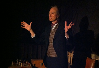
Went to the fantastic Enlightenment Café tonight, in the Old Vic Tunnels!


A fantastic immersive experience, you are invited to wander through the space, meeting with various characters, experts in their fields, from Victorian times, in little rooms, where they teach you a nugget of information.  Or lots.  


Originating from the Coffee Houses of the 17th century, Enlightenment Cafés (also known as Penny Universities) were ‘theatres of exchange’ and social hubs for new thinking in science, philosophy, politics and arts - places where ideas came together and bubbled with excitement.  LAStheatre brings this concept into the 21st century and promises it will be just as intellectually promiscuous.


Tonight I learnt about astro-physics and solar storms (and if you see sparkly things in your eyes, that means there's loads of radiation about, so best get the hell outta there!), spherical geometry, hyperbolic geometry, arsenic poisoning, and how to lay a table.


There were soap box lectures, "tag" debating and some sort of fireworks expert, which annoyingly I missed!  Top tip, sign up to stuff as soon as you get in, if you want to see something in particular, as some of it has limited space.


Only on for a few more days, well worth a trip, my cheeks were hurting I was smiling so much!  You can tell the team put in loads of effort pulling it all together.  Everyone was really enjoying themselves.


Just great, chatting to people, and learning something.  All the actors were great, staying in character the whole time.  Sadly I missed the musical acts, as have a super early start in the morning.


It's only on till the 3rd of June!  Don't know if there are many tickets left, but worth trying!


Pics are a bit blurry  ... iPhone.... dark spaces... but you get the gist!


and of course.... a spot of graffiti!  Old Vic Tunnels, always good to see the new works.  


Tuesday, 29 May 2012

Primark Edinburgh

When I first started at Dalziel and Pow, I was on the team undertaking the Primark Edinburgh Project.  Unfortunately, I left before it had finished, but it was really great seeing it in the flesh, all finished, this weekend.


A really fantastic building connecting Rose Street and Prince's Street, the new Primark is part of the City's plan to drive more custom down this end of the main shopping drag, much like Primark's Marble Arch store has brought more "punters" to that end of Oxford Street.


If you happen to be in Edinburgh, and fancy getting a stellar view of the Castle.. make your way up to the Kid's department on the top floor.  One of the best spaces in the store coupled with a great view, but I doubt many people see it.  


The building was designed and built by 3D Reid with heavy design input and direction from D&P.  It looks fantastic.  I am so impressed.  Even if Primark moves on, it is a lovely new building for Edinburgh, sensitively designed to have the same language as the rest of the street.


It's really exciting seeing details you developed and sketched out, finally built.


Not many interior shots, as I wasn't really allowed.  Which is kind of a shame, as that was our main bit!  If you are there, check out the hanging plinths in the windows, and the massive shelves along the double height spaces.  They are designed to move down to the Basement mechanically, so the Visual Merchandise can be changed.


Couldn't have picked a better day, really.....


Bonny Scotland

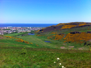
Right, so it was BOILING in London this weekend.. so I headed North, to Edinburgh!  Still lovely and sunny and warm, but not sweltering and stifling.  Catching up with my good friend, glass artist Laura Smith and her sister Emily, I saw some sights, clambered up a big hill, and chilled out.  London seems to be moving very fast these days, so it was nice to stop for a bit!


A few pics below... Primark Edinburgh in next post (above).


Friday, 25 May 2012

Clerkenwell Design Week

Even though I'm a tad "furnitured" out, after Milano last month, I went along to Clerkenwell Design Week.


Lots to see and do, unfortunately I had deadlines, so didn't get around all of it! Did manage to pop into the Farmiloe Building, really liked Bethan Gray's stuff, as well as Another Country's wooden toys.  lush.


Also check out the car sculpting by Jaguar!  So that's how they do it.....


Jasmine and Cake

My dear friend took me to Petersham Nurseries the other day, for lunch and a wander. 


If you've never been,  I'd highly recommend it!  A half hour walk from Richmond Station, it's totally gorgeous.  A restaurant (Michelin starred!) and tea room, within a horticultural nursery.  


In the tea room, it was fabulous, as it smelt of Jasmine (as it was growing everywhere) and the food was really tasty.  I'd highly recommend the carrot cake!  


It is a retail store too, you can buy cute little bits for lots of money.. so yes, very nice for a treat!


Afterwards we walked back along the river, through a regatta, and past a really lovely ceramicist, who sells her work straight from her workshop on the river.  Lovely pieces, reasonably prices (too reasonable, in my opinion!) and dishwasher and microwave safe!  What more could you want!


Waste Not

I went to this art installation at the Barbican aaaages ago, but never got around to posting!  It's on until the 12th of June,  so I thought I should pop it up, incase you think it's worth a visit!


Chinese artist Song Dong, has artfully arranged all the collections of items his mother collected over 5 decades, subscribing to a Chinese mantra "Waste Not", which was crucial to surviving during the tough times. 


Perhaps poignant, as we are facing, or indeed are in, an age of austerity.  


Also quite reminds me of my late grandmother's "art room" which was filled with organised bits and bobs, in marked tins and shoeboxes.  So I quite liked it.


It's in the Barbican's Curve Gallery, which is free!  


Tuesday, 15 May 2012

Jewels and Angles

Long a fan of Melanie Eddy's work, I was lucky enough to go and see her new studio space at the recently constructed Goldsmiths' Centre (by John Lyall) on Britton Street in Clerkenwell.


Also being a Bermudian, it's great to see a fellow country woman doing well in design in London town.


A few pics of her lovely pieces.  If anyone is wondering, I'd love some of the gold earrings, and a silver necklace! 


The Goldsmith's Centre is the Goldsmiths' Company's largest-ever investment in the future of the the industry and in the continuing success of those who work in precious metals.


The studio spaces are leased out with the remit that the tenants will help train the next generation of craftspeople.


They've got a gorgeous cafe, and put on exhibitions and events.  Great to have a new venue in London!


Monday, 14 May 2012

British Design 1948-2012

On Sunday, I went to the British Design Exhibition at the V&A.  It was fantastic.  
It was easily one of the best exhibitions I've seen this year, and I would encourage you to go and see it.


I loved all of the post-war, brutalist work, along with the fabulous drawings and paintings which came out of that time period.  The 60's..... not such a huge fan, but loved the punk-era, and all the avant-garde fashion.  


I even saw a bit of Damien again, there was a room dedicated to his collaboration to produce the Restaurant/Bar "Pharmacy" in Notting Hill (closed now).


The exhibition was capped off with a huge model of the Concorde (would have LOVED to have flown on that....) and computer games, including Grand Theft Auto. 


It's great, after lusting after beautiful furniture from Italy, France and Scandinavia in Milan last month, to be reminded of all the fantastic design produced here in the UK.


As usual, no photos allowed, but I really think you should go it for yourself. 


The V&A did a fantastic job pulling together lots of great pieces from across the years, providing a fascinating exhibition.


I actually felt much more patriotic after going to this, than I did last week... when I went to Windsor Castle to see  a massive Parade of Horses in honour of the Queen.  Mind you, the fact I was covered in mud (bad shoe choice!  Should've worn wellies!) might have had something to do with it.


And of course, I topped it all off with a tea in the gorgeous cafe.... gotta love it!


Tuesday, 8 May 2012

Damien Damien Damien

I went to the Damien Hirst exhibition at the Tate Modern a few weeks ago.... not sure what to say!  I guess I should have expected what it was, and it did feel very commercial, but it left me feeling a bit cold. Or maybe shell shocked. 


I loved the butterfly room (YAY, alive and flying! Not good for you if you get freaked out by winged beauties flying at you, FYI), and the spinning colour paintings, but other than that, I just felt very un-engaged.  Towards the end, it all got more and more commercial.  Stunning pieces, using dead insects (flies and butterflies) but I suppose it was just very overwhelming.


Usually I love retrospectives, but I didn't feel like I had that "aha, that's what it's all about" moment. Mind you, I'm not a Art Critic.


There was also the skull covered in diamonds in the Turbine Hall.  Conversely, his most expensive work, you don't have to pay to see.


http://www.tate.org.uk/visit/tate-modern


My house, your house, Bauhaus


The long awaited Bauhaus exhibition has opened at the Barbican, here in London!  I went along to check it out yesterday, along with hundreds of other people.  Very busy!  


I found the exhibition informative, and interesting, but LOTS of information.  It felt kind of like a scrapbook, there were informal photos of students and faculty, and it was great to see the extent the movement reached, through from architecture through to theatre. 


What happens with theatre design these days?  Perhaps looking at "movements" is easier in retrospective, but I really feel disconnected with theatre as a designer.  


My definite favourites were the textile designs, saturated watercolours, wood cuts, lithographs and Kandinsky paintings (on loan from MoMA).


As usual, gallery police, so you'll have to get down there yourself to have a proper look, but worth the trip.


Lots to take in, possibly too much.  I left the exhibition feeling a bit more educated, but not particularly inspired.  But you've got to see it really.  And it's just my opinion....


Top tip... book tickets in advance, cheaper, and no waiting!  Link below.


Confidence and Light

Whilst at Milan, we went to the French exhibition area, which was really lovely, lots of inspirational design, and an open exhibition space.  Confidence and Light were one of the exhibitors, and they had a great collection, including works by Arik Levy and Yves Barrier.  I was particularly fond of the "Magnet" light by Arik Levy.  LED, magnetic, so it is easily flexible, yet minimal, I think it has all the trappings of a modern classic.  I suppose time will tell, but once I get into my new studio, you might see one of these on my desk if you stop by!  Make mine a frosted black one....